


An Analysis of the Gucci Lido Campaign
Creative Direction, Styling and Photography for a Commercial Campaign

In my introductory post, I explored the concept of Modes as the intersection between creativity and commerciality in fashion. This dance is particularly evident in fashion campaigns, where creative direction must be styled and presented in a way that resonates with consumers, drives desire, and ultimately sells product.
The following is an analysis of the Gucci Lido campaign, prepared as part of my Master’s in Luxury Fashion Management where I viewed the task through this lens. It examines how styling and photography can act as the connective tissue between the vision of the Creative Director and style office and the brand’s commercial objectives. In this context, styling and photography aren’t just about assembling and shooting looks, they translate a fashion narrative into a visually compelling, marketable message.
The Gucci Lido campaign was launched in May 2024 to promote a new capsule collection of beachwear and summer accessories, designed to reflect a lifestyle of refined leisure and elegance and capture the essence of an Italian Summer. It’s noticeably different to Charli XCX’s BRAT take on this, with neon-orange drinks on the beach, bad tattoos on leather-tanned skin, and Jesus Christ on a plastic sign - which dropped around the same time (and is more in my tax bracket). It marked one of the first major visual campaigns under Sabato De Sarno, Gucci’s former Creative Director, and signaled a new direction for the house, rooted in minimalism and cinematic storytelling. TLDR: Everything is romantic.
Styling Analysis - Crafting Elegance and Identity
In this campaign, the styling reflects a clear pivot toward refined sensuality and Mediterranean elegance. There's a deliberate nod to 1970s Italian Riviera fashion with clean silhouettes, sun-drenched colors, and accessories that feel both nostalgic and aspirational.
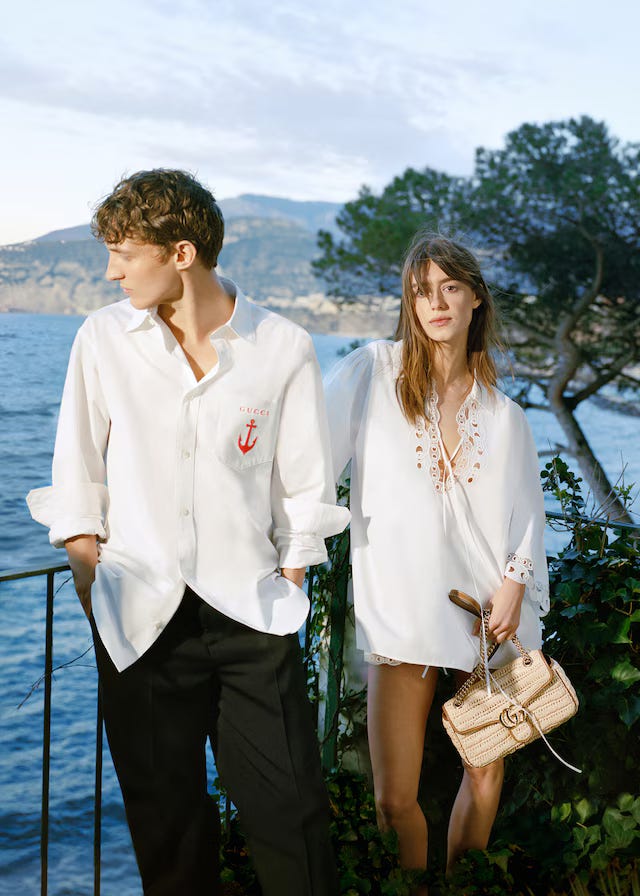
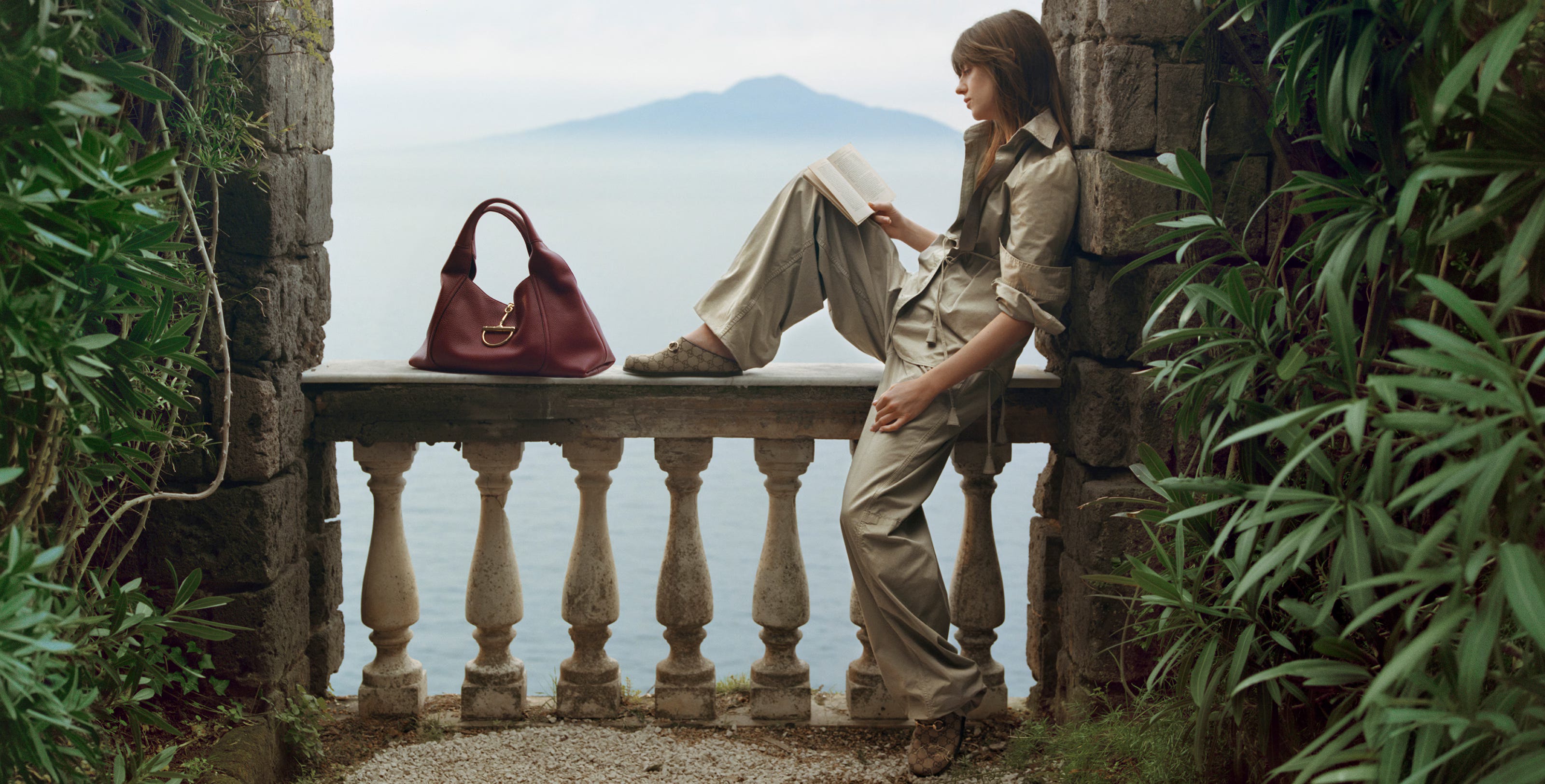
What’s particularly striking is how Gucci’s inherently maximalist DNA is handled. When the garments are bold or heavily branded, the styling leans into it rather than pulling back, but with control. Statement pieces are amplified through carefully chosen accessories: large totes, gold-toned jewelry, and oversized sunglasses (image #2).
This approach marks a distinct departure from the eclectic maximalism of former Creative Director Alessandro Michele’s era, which featured excess for its own sake in my opinion. Under Sabato De Sarno, the direction felt more focused with a step toward minimalism with a high-impact edge. There's restraint, but never at the expense of personality.
Key styling elements include:
Swimwear as a base layer, styled with non-functional yet aspirational pieces
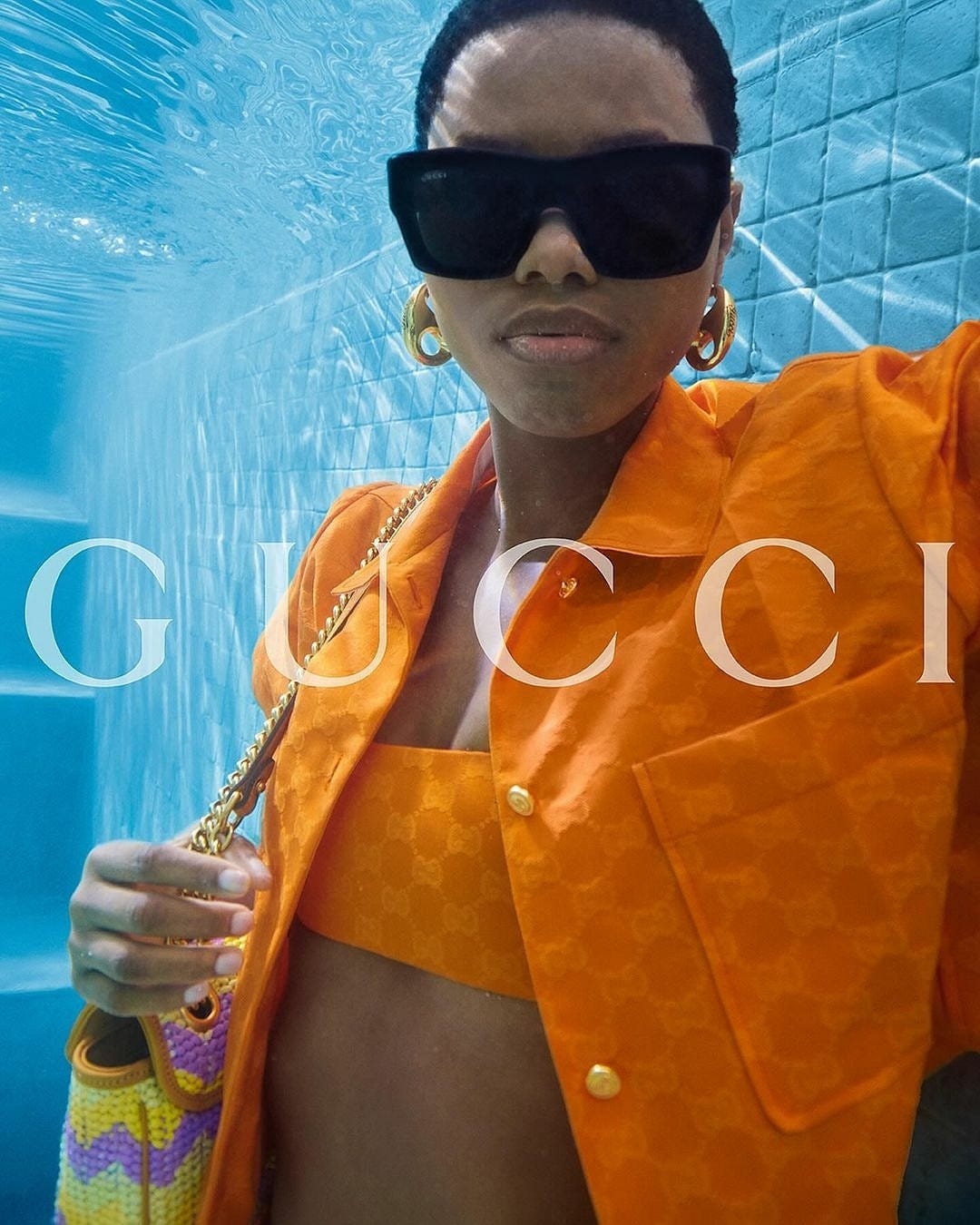
A Mediterranean palette of creams, deep reds, and vibrant blues (image #3)
Textural contrasts through terry cloth, silks, leather, and technical knits (image #3)
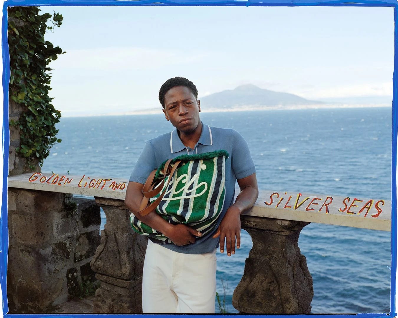
Relaxed Silhouettes evoke a sense of effortless sophistication with fluid tailoring, soft drapes, and clean lines (image #4)
Accessories that feel both vintage and modern
Photography - Visual Storytelling and Narrative
Setting & Composition:
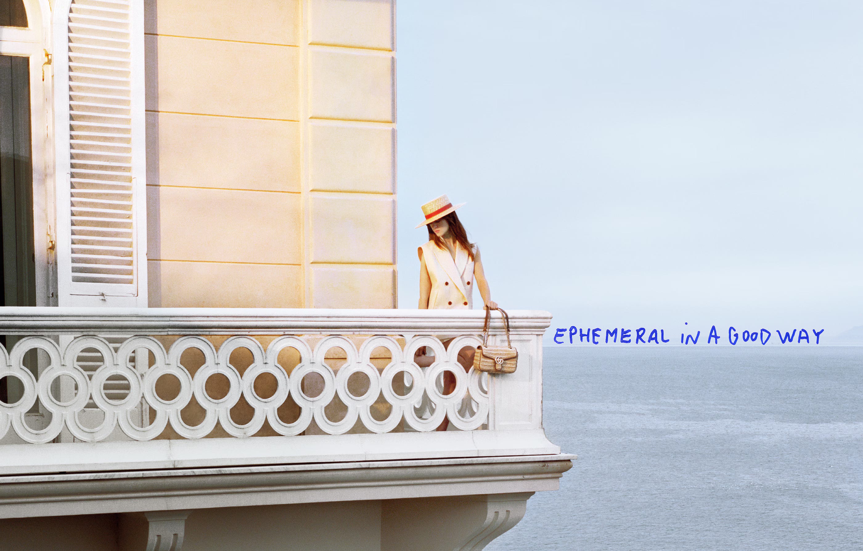
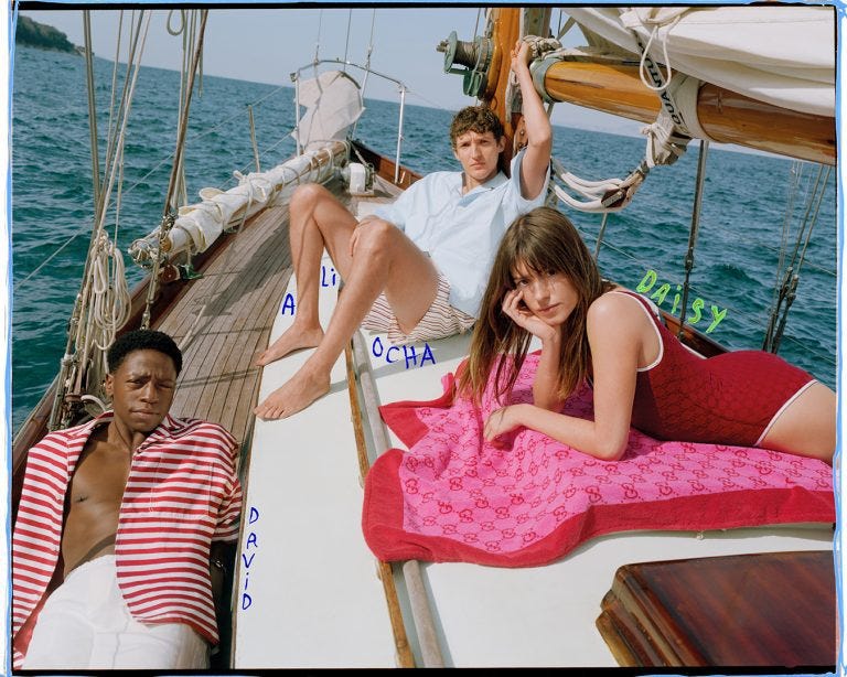
Photographed in high-contrast, natural light with symmetrical framing . The seaside and poolside environments act as both literal and symbolic spaces representing leisure, escape, and luxury.
Pacing & Imagery:
Each visual is designed as a standalone editorial vignette that is static, composed, and cinematic. There is minimal movement, aligning with the trend of “quiet luxury”. The characters (models) function less as personalities and more as avatars of a lifestyle (image #5).
Emotional Tone:
Detached, elegant and controlled. No performative emotion, just an atmosphere of exclusive calm, promoting a luxury image of understatement and distance.
Creative Signatures
Sabato De Sarno (Creative Director):
This campaign reflects De Sarno’s broader vision of restraint, elegance, and emotional neutrality. His styling leans toward timeless, high-end fashion codes, with careful curation and consistent tone across assets.
David Sims (Photographer):
Known for minimal, controlled compositions and the ability to capture depth with simplicity. His role here is pivotal: he strips away visual noise to let product and styling carry the narrative. Sims’ photographic language underscores the mood of exclusivity and sophistication.
Georgia Pendlebury (Stylist):
Recognised for her refined yet instinctive approach to styling, Pendlebury brings a sense of ease and balance to the campaign. Her work complements De Sarno’s vision through thoughtful layering, subtle textures, and a focus on silhouette. Pendlebury’s hand ensures the looks feel lived-in yet elevated, reinforcing the campaign’s quiet confidence and understated luxury (image #6).
My personal take.
Personally, I preferred Gucci under Sabato De Sarno. His tenure stripped the brand back to it’s heritage, introducing more sleek and wearable collections that emphasised craftsmanship. It was a refreshing departure from the heavily embellished, maximalist style popularised by Alessandro Michele - a look that had become widely imitated and frequently counterfeited. De Sarno’s background is in Dolce & Gabbana, where he was head of design for a house known for its extravagance and maximalism, so it’s even more interesting he was the man to steer Gucci back to refinement. David Sims and Georgia Pendlebury got the memo and brought a vision into reality in this campaign. Particular credit to Sims.
The shift to refined Gucci wasn’t universally embraced. Many critics and fashion communities felt the designs lacked the boldness expected from Gucci, calling them “boring” or too reminiscent of high-street brands. I get that. There has to be space for both The Row’s quiet precision and Mugler’s high-drama spectacle to keep things interesting in fashion. Gucci just happened to land closer to my end of the spectrum, and selfishly, I liked that. Money talks, and despite the clarity of his vision, it didn’t translate commercially ….Gucci saw a 25% drop in sales in late 20241, and De Sarno exited just ahead of the Fall/Winter 2025 show.
Sabato De Sarno’s time at Gucci was short, and reflects the broader industry challenge of balancing artistic direction with market pressure - the creativity and commerciality question raises its head again. It’s always fascinating when a creative director repositions a brand. Sometimes it lands(sells) , sometimes it doesn’t.
Not to suggest that a Creative Director single-handedly controls the fate of a multi-billion-euro brand. I acknowledge sales depend on a cocktail of global economics, consumer mood swings, TikTok trends, and whether Mercury is in retrograde.